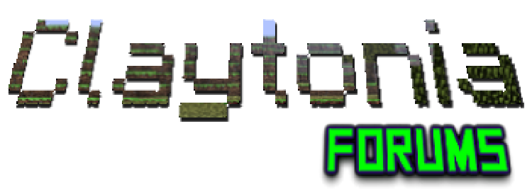
Title: GIVE US YOUR INPUT on the Claytonia logo/banner. READ THIS we need your help.
Post by: Clay on September 03, 2013, 12:17:03 AM
Post by: Clay on September 03, 2013, 12:17:03 AM
Looking for a new Claytonia logo!
Must have a gaming theme, a transparent background.
If you have photo shop skills and some free time make a few images and post them on this thread. We will vote on them and use the most popular one.
You will receive full credit and life time vip status on the semi-vanilla server. I know a lot of you don't play on the semi server ,however, I'm hoping you would do this for the community and not the "rewards".
Title: Re: logo
Post by: Tslat on September 03, 2013, 03:35:03 AM
Post by: Tslat on September 03, 2013, 03:35:03 AM
By logo you meant banner, right? This type of thing?
Title: Re: logo
Post by: Clay on September 03, 2013, 07:53:53 AM
Post by: Clay on September 03, 2013, 07:53:53 AM
Yep anything close to this is is great
Title: Re: logo
Post by: Zito on September 04, 2013, 11:51:30 AM
Post by: Zito on September 04, 2013, 11:51:30 AM
I would make one, but I don't have any photoshop software. I might be able to do something if I did.
Title: Re: logo
Post by: Clay on September 04, 2013, 03:29:06 PM
Post by: Clay on September 04, 2013, 03:29:06 PM
use GIMP...haha
hey it works...
hey it works...
Title: Re: logo
Post by: Zito on September 04, 2013, 03:32:10 PM
Post by: Zito on September 04, 2013, 03:32:10 PM
What's that?
Title: Re: logo
Post by: Clay on September 04, 2013, 03:44:03 PM
Post by: Clay on September 04, 2013, 03:44:03 PM
a open source "photo shop"
http://www.gimp.org/ (http://www.gimp.org/)
from what i understand it can do most of what other programs can but is not as easy to use.
but, heres the kicker..... ITS FREE
http://www.gimp.org/ (http://www.gimp.org/)
from what i understand it can do most of what other programs can but is not as easy to use.
but, heres the kicker..... ITS FREE
Title: Re: logo
Post by: Tslat on September 04, 2013, 03:52:53 PM
Post by: Tslat on September 04, 2013, 03:52:53 PM
You can Also try paint.net, it's not as powerful but has a few options that gimp doesn't.. I use both in combination with each other usually
Title: Re: logo
Post by: Zito on September 04, 2013, 04:17:35 PM
Post by: Zito on September 04, 2013, 04:17:35 PM
I have actually used Paint.net before, and it is pretty good.
Title: Re: logo
Post by: Clay on September 09, 2013, 04:25:20 PM
Post by: Clay on September 09, 2013, 04:25:20 PM
still looking for banners and or logos.
for a logo something with the WASD keys in it would be great.
im working on learning how to use GIMP but there is a large learning curve.
for a logo something with the WASD keys in it would be great.
im working on learning how to use GIMP but there is a large learning curve.
Title: Re: logo
Post by: Tslat on September 09, 2013, 04:30:44 PM
Post by: Tslat on September 09, 2013, 04:30:44 PM
I can use paint.net, gimp, or photoshop.. I just don't have any ideas lol
Title: Re: logo
Post by: Clay on September 09, 2013, 06:48:01 PM
Post by: Clay on September 09, 2013, 06:48:01 PM
joe had a bunch of ideas, ill get him to post em on here.
Anyone else with ideas for a claytonia logo PLEASE post!
Anyone else with ideas for a claytonia logo PLEASE post!
Title: Re: logo
Post by: Farquad94 on September 09, 2013, 07:12:27 PM
Post by: Farquad94 on September 09, 2013, 07:12:27 PM
would be cool to have a minecraft cube but inside the frames on diffrent sides would be other games.
The idea is that this community has a framework of minecraft but other games 'in' it as well 8)
The idea is that this community has a framework of minecraft but other games 'in' it as well 8)
Title: Re: logo
Post by: Tslat on September 09, 2013, 07:14:12 PM
Post by: Tslat on September 09, 2013, 07:14:12 PM
Problem with cubes is you can only see 2 faces at a time.. If you try to make it more, the faces all get jumbled up with each other
Prove me wrong if you can, I'd love to see it done lol
Prove me wrong if you can, I'd love to see it done lol
Title: Re: logo
Post by: Farquad94 on September 09, 2013, 07:25:39 PM
Post by: Farquad94 on September 09, 2013, 07:25:39 PM
I was thinking one big cube or so with little images on the 2 faces and minecraft grass pm top
Title: Re: logo
Post by: Tslat on September 09, 2013, 09:03:32 PM
Post by: Tslat on September 09, 2013, 09:03:32 PM
Sounds like the minecraft wiki logo lol, I'll give it a go and see how it works out...
What I'll do is make the ideas on their own, instead of the whole logo, ten we can decide which ones to put together for the final result?
What I'll do is make the ideas on their own, instead of the whole logo, ten we can decide which ones to put together for the final result?
Title: Re: logo
Post by: Clay on September 09, 2013, 09:32:55 PM
Post by: Clay on September 09, 2013, 09:32:55 PM
i want the WASD keys in there somewhere. an element of minecraft is an obvious choice but I want to show that we do more than minecraft. (the community is getting ready to expand, a lot)
Title: Re: logo
Post by: Zito on September 09, 2013, 10:09:59 PM
Post by: Zito on September 09, 2013, 10:09:59 PM
What was that about expansion Clay?
Title: Re: logo
Post by: Tslat on September 09, 2013, 10:38:50 PM
Post by: Tslat on September 09, 2013, 10:38:50 PM
He's saying that he's ready to recruit a lot more people to the vanilla server
Title: Re: logo
Post by: Devo_008 on September 09, 2013, 10:39:14 PM
Post by: Devo_008 on September 09, 2013, 10:39:14 PM
but the Tekkit server is the new baby?
Title: Re: logo
Post by: Clay on September 09, 2013, 11:01:17 PM
Post by: Clay on September 09, 2013, 11:01:17 PM
adding more variety in game servers, aka different games...
this will give us more donating possibilities from a wider demographic. the hope is that more donations will support the new servers and more MC servers.
im still working on learning the tech stuff behind it all.
this will give us more donating possibilities from a wider demographic. the hope is that more donations will support the new servers and more MC servers.
im still working on learning the tech stuff behind it all.
Title: Re: logo
Post by: Clay on September 09, 2013, 11:01:32 PM
Post by: Clay on September 09, 2013, 11:01:32 PM
enough about that though, logo is needed....
Title: Re: logo
Post by: Tslat on September 09, 2013, 11:19:20 PM
Post by: Tslat on September 09, 2013, 11:19:20 PM
Again, if you need any help with the tech, I can help lol
Title: Re: logo
Post by: Zito on September 10, 2013, 10:12:39 AM
Post by: Zito on September 10, 2013, 10:12:39 AM
For the logo, what about the WASD keys, with the W kind of a Minecraft Grass block, and the rest other games? I am not sure how this would look, just an idea...
Title: Re: logo
Post by: joe21221 on September 10, 2013, 12:29:33 PM
Post by: joe21221 on September 10, 2013, 12:29:33 PM
Im not artist at all, but an idea i had could be a compass. but instead of N S E W we could do WASD all on different points of the compass. And perhaps the compass thing could be inside of a larger globe done kinda pixely like. Maybe even each letter of the WASD could be done with a different style similar to the titles of some of the games we play. That part wasnt my idea, i read that above, i think.
Just throwing out ideas
Just throwing out ideas
Title: Re: logo
Post by: joe21221 on September 10, 2013, 01:38:55 PM
Post by: joe21221 on September 10, 2013, 01:38:55 PM
This is a horrible drawing idea, just to try to illustrate what i was talking about. Dont judge the horrid drawing.

Title: Re: logo
Post by: Zito on September 10, 2013, 02:15:40 PM
Post by: Zito on September 10, 2013, 02:15:40 PM
I think we should refine this concept amd make it the new logo
Title: Re: logo
Post by: Tslat on September 10, 2013, 04:15:54 PM
Post by: Tslat on September 10, 2013, 04:15:54 PM
mmm, needs to be slightly more refined. Also the D is quite abstract, and may need a rework
Title: Re: logo
Post by: joe21221 on September 10, 2013, 04:35:48 PM
Post by: joe21221 on September 10, 2013, 04:35:48 PM
please please please, some redo it if people like that. I used a duct tape roll for a circle and my phone for straight lines. also in each section you could do some small design representing the game its from.
I think the W was drawn with the format of the minecraft title
The A was the format of Civ
The S was the format of 7 days to die
and the D was the format of war thunder.
Im horrible at putting ideas together.
I know Rockin is supposedly an artist!
I think the W was drawn with the format of the minecraft title
The A was the format of Civ
The S was the format of 7 days to die
and the D was the format of war thunder.
Im horrible at putting ideas together.
I know Rockin is supposedly an artist!
Title: Re: logo
Post by: Zito on September 10, 2013, 04:40:59 PM
Post by: Zito on September 10, 2013, 04:40:59 PM
We need to get Rockin in on this!
Title: Re: logo
Post by: joe21221 on September 10, 2013, 05:02:14 PM
Post by: joe21221 on September 10, 2013, 05:02:14 PM
I see what ya did there. We need to get rockin on this. like going on this.
Title: Re: logo
Post by: Zito on September 10, 2013, 05:05:55 PM
Post by: Zito on September 10, 2013, 05:05:55 PM
You saw it indeed...
Title: Re: logo
Post by: Clay on September 10, 2013, 05:31:04 PM
Post by: Clay on September 10, 2013, 05:31:04 PM
how about in the middle we put a "CU" for claytonians unite
its the clan tag we have been using in other games.
its the clan tag we have been using in other games.
Title: Re: logo
Post by: joe21221 on September 10, 2013, 05:45:25 PM
Post by: joe21221 on September 10, 2013, 05:45:25 PM
The CU would actually be perfect. take out the little diamond in the square and replace it with a fancyish CU.
Title: Re: logo
Post by: Zito on September 10, 2013, 06:08:16 PM
Post by: Zito on September 10, 2013, 06:08:16 PM
I like that idea a lot.
Title: Re: logo
Post by: Tslat on September 10, 2013, 06:44:28 PM
Post by: Tslat on September 10, 2013, 06:44:28 PM
Keep working on this guys and either I or rockin can bring it to reality in digital form
Title: Re: logo
Post by: Zito on September 10, 2013, 07:10:00 PM
Post by: Zito on September 10, 2013, 07:10:00 PM
How about the CU in the center is kind of a block lettering, and inside it are the titles of some of the games we play?
Title: Re: logo
Post by: Tslat on September 10, 2013, 07:36:38 PM
Post by: Tslat on September 10, 2013, 07:36:38 PM
You don't wanna overload a point of information with different information, it's a basic design principle
Title: Re: logo
Post by: Zito on September 10, 2013, 07:46:37 PM
Post by: Zito on September 10, 2013, 07:46:37 PM
Awwwww...
Title: Re: logo
Post by: Clay on September 10, 2013, 09:32:08 PM
Post by: Clay on September 10, 2013, 09:32:08 PM
after a google search i noticed that most game communities have their tag in the logo, hence the CU
examples:
https://www.google.com/search?q=gaming+logo&tbm=isch&tbo=u&source=univ&sa=X&ei=yscvUt2FGKmuyQHGmYHIBA&ved=0CC4QsAQ&biw=1280&bih=920#q=gaming+logos&tbm=isch (https://www.google.com/search?q=gaming+logo&tbm=isch&tbo=u&source=univ&sa=X&ei=yscvUt2FGKmuyQHGmYHIBA&ved=0CC4QsAQ&biw=1280&bih=920#q=gaming+logos&tbm=isch)
Title: Re: logo
Post by: Farquad94 on September 10, 2013, 09:39:57 PM
Post by: Farquad94 on September 10, 2013, 09:39:57 PM
Yea get a BA logo like one of those haha that would be awesome
Title: Re: logo
Post by: Tslat on September 10, 2013, 10:12:03 PM
Post by: Tslat on September 10, 2013, 10:12:03 PM
That gave me an idea actually. I might try a few things when I get home
Title: Re: logo
Post by: Zito on September 11, 2013, 10:23:58 AM
Post by: Zito on September 11, 2013, 10:23:58 AM
Post your idea Tslat!
Title: Re: logo
Post by: Tslat on September 11, 2013, 04:05:01 PM
Post by: Tslat on September 11, 2013, 04:05:01 PM
lol this seems like a weekend job.. I just can't seem to find the time during the working week
Title: Re: logo
Post by: Zito on September 11, 2013, 04:13:26 PM
Post by: Zito on September 11, 2013, 04:13:26 PM
Ah, ok. Gotta love working, eh?
Title: Re: logo
Post by: Clay on September 24, 2013, 12:45:29 AM
Post by: Clay on September 24, 2013, 12:45:29 AM
bump, still looking for more ideas
Title: Re: logo
Post by: DubhAingeal on September 24, 2013, 12:45:55 AM
Post by: DubhAingeal on September 24, 2013, 12:45:55 AM
Sooo i have seen the CU i propose the tag C-R-U for Claytonia Reapers United and the motto "never leave a gamer behind" we can use the EVE icon template for our corp as a sigil.
Title: Re: logo
Post by: Tslat on September 24, 2013, 02:02:38 AM
Post by: Tslat on September 24, 2013, 02:02:38 AM
Can we not use eve as the basis for the claytonia minecraft forums?
Title: Re: logo
Post by: Clay on September 24, 2013, 04:51:37 AM
Post by: Clay on September 24, 2013, 04:51:37 AM
Quote from: Tslat on September 24, 2013, 02:02:38 AM
Can we not use eve as the basis for the claytonia minecraft forums?
Agree, but we still need a logo
Sent from my Nexus 7 using Tapatalk 4
Title: Re: logo
Post by: Tslat on September 24, 2013, 05:22:26 AM
Post by: Tslat on September 24, 2013, 05:22:26 AM
Lol yeah, I kinda forgot about it before... I'll see if I remember this weekend
Title: Re: logo
Post by: DubhAingeal on September 24, 2013, 05:48:55 AM
Post by: DubhAingeal on September 24, 2013, 05:48:55 AM
Its also the tag we us for the war thunder clan as well face it we have grown beyond that of just minecraft and we need something that can be universal. Not just something used for minecraft.
Title: Re: logo
Post by: Zito on September 25, 2013, 11:09:14 AM
Post by: Zito on September 25, 2013, 11:09:14 AM
Eve has it's own forums for a reason though. This is the Minecraft and other games section of Claytonia...
Title: Re: logo
Post by: Clay on September 25, 2013, 01:58:08 PM
Post by: Clay on September 25, 2013, 01:58:08 PM
Quote from: Zito on September 25, 2013, 11:09:14 AMLol. Mr stay on the original topic of the thread
Eve has it's own forums for a reason though. This is the Minecraft and other games section of Claytonia...
Back to the logo. All ideas are welcome
Title: Re: logo
Post by: Farquad94 on September 25, 2013, 02:00:01 PM
Post by: Farquad94 on September 25, 2013, 02:00:01 PM
Im waiting for Tslat's proposal
Title: Re: logo
Post by: Zito on September 25, 2013, 02:37:11 PM
Post by: Zito on September 25, 2013, 02:37:11 PM
I still like Joe's compass.
Title: Re: logo
Post by: Tslat on September 25, 2013, 04:25:39 PM
Post by: Tslat on September 25, 2013, 04:25:39 PM
Yeah I don't really work on it during the week, it's more of a weekend proposal.. I wanna try make a more high detailed and shiny version of his compass.. with a few changes... keep making suggestions.. they'll all help out
Title: Re: logo
Post by: Zito on September 25, 2013, 04:40:22 PM
Post by: Zito on September 25, 2013, 04:40:22 PM
Quote from: joe21221 on September 10, 2013, 01:38:55 PM
This is a horrible drawing idea, just to try to illustrate what i was talking about. Dont judge the horrid drawing.
Just so people get a look at it again.
Title: Re: logo
Post by: Clay on September 25, 2013, 08:37:06 PM
Post by: Clay on September 25, 2013, 08:37:06 PM
Need more suggestions. Tell ppl in game to nake suggestions.
Sent from my HTCEVOV4G using Tapatalk 4
Sent from my HTCEVOV4G using Tapatalk 4
Title: Re: logo
Post by: Clay on September 25, 2013, 11:23:16 PM
Post by: Clay on September 25, 2013, 11:23:16 PM
I found this free photo editing software online and thought some of you might want to try your hand at making claytonia a logo
http://pixlr.com/editor/ (http://pixlr.com/editor/)
http://pixlr.com/editor/ (http://pixlr.com/editor/)
Title: Re: logo
Post by: Tslat on September 26, 2013, 02:04:22 AM
Post by: Tslat on September 26, 2013, 02:04:22 AM
You can also go to GetPaint (http://www.getpaint.net)
or Gimp (http://www.gimp.org)
or Gimp (http://www.gimp.org)
Title: Re: logo
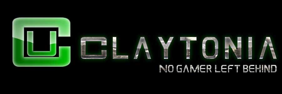
Post by: Tslat on September 26, 2013, 03:17:38 AM
Post by: Tslat on September 26, 2013, 03:17:38 AM
Hmm.. I was testing out a metallic type look.. not sure what to think..
This is without the WASD part, since I couldn't figure out how to make the triangles pointing to each letter look yet..
Any thoughts?

This is without the WASD part, since I couldn't figure out how to make the triangles pointing to each letter look yet..
Any thoughts?
Title: Re: logo
Post by: Clay on September 26, 2013, 04:11:50 AM
Post by: Clay on September 26, 2013, 04:11:50 AM
PLEASE give some input into this.
You can use the programs mentioned above to do some editing and we can polish it later.
http://pixlr.com/editor/ (http://pixlr.com/editor/)
this link is web based so you dont need to install anything and you can still modify the image
PLEASE we need your help!
You can use the programs mentioned above to do some editing and we can polish it later.
http://pixlr.com/editor/ (http://pixlr.com/editor/)
this link is web based so you dont need to install anything and you can still modify the image
PLEASE we need your help!
Title: Re: logo
Post by: joe21221 on September 26, 2013, 08:47:51 AM
Post by: joe21221 on September 26, 2013, 08:47:51 AM
I am fond of this!
Title: Re: logo
Post by: Zito on September 26, 2013, 09:41:39 AM
Post by: Zito on September 26, 2013, 09:41:39 AM
I like it. It's a great base design.
Title: Re: logo
Post by: Clay on September 26, 2013, 02:29:06 PM
Post by: Clay on September 26, 2013, 02:29:06 PM
Quote from: joe21221 on September 26, 2013, 08:47:51 AM
I am fond of this!
Quote from: Zito on September 26, 2013, 09:41:39 AM
I like it. It's a great base design.
we need ideas on how to expand on it.
ideas?
Title: Re: logo
Post by: Zito on September 26, 2013, 04:11:02 PM
Post by: Zito on September 26, 2013, 04:11:02 PM
Quote from: Zito on September 10, 2013, 07:10:00 PM
How about the CU in the center is kind of a block lettering, and inside it are the titles of some of the games we play?
Title: Re: logo
Post by: Tslat on September 26, 2013, 04:13:48 PM
Post by: Tslat on September 26, 2013, 04:13:48 PM
You will never be able to read them..
This + "Claytonia" have to fit into an 800wide x 300high banner size image
This + "Claytonia" have to fit into an 800wide x 300high banner size image
Title: Re: logo
Post by: JudgeCrane on September 26, 2013, 06:41:35 PM
Post by: JudgeCrane on September 26, 2013, 06:41:35 PM
Maybe make the games in the background instead of in the logo. Or put minecraft icons in the middle like creeper head or block icons, since we are minecraft based.
Title: Re: logo
Post by: Zito on September 26, 2013, 07:15:03 PM
Post by: Zito on September 26, 2013, 07:15:03 PM
If you are going to put Claytonia in it, say that next time...
Title: Re: logo
Post by: Tslat on September 26, 2013, 08:47:38 PM
Post by: Tslat on September 26, 2013, 08:47:38 PM
It was literally the second post of this thread lol
Title: Re: logo
Post by: Zito on September 26, 2013, 08:54:26 PM
Post by: Zito on September 26, 2013, 08:54:26 PM
I don't see how you are planning on putting the compass and that in there. It seems like it would be too bulky and crowded.
Title: Re: logo
Post by: Tslat on September 26, 2013, 10:13:38 PM
Post by: Tslat on September 26, 2013, 10:13:38 PM
No, next to it... Claytonia on the left, logo alongside it
Title: Re: logo
Post by: Zito on September 26, 2013, 10:20:23 PM
Post by: Zito on September 26, 2013, 10:20:23 PM
I think we should go with just one or the other.
Title: Re: logo
Post by: Tslat on September 26, 2013, 10:22:57 PM
Post by: Tslat on September 26, 2013, 10:22:57 PM
*facepalm* ok we'll I still need to know what everyone thinks lol, this is just getting worse
Title: Re: logo
Post by: Zito on September 26, 2013, 10:24:22 PM
Post by: Zito on September 26, 2013, 10:24:22 PM
How is it getting worse? I am suggesting things for the logo. Don't act like my ideas are irrelevant. That's just rude.
Title: Re: logo
Post by: Tslat on September 26, 2013, 10:31:38 PM
Post by: Tslat on September 26, 2013, 10:31:38 PM
I didn't...? I'm acting like your opinions aren't the only one that matters..?
It's made for the community, not just for you.. I'm looking for more than one opinion
It's made for the community, not just for you.. I'm looking for more than one opinion
Title: Re: logo
Post by: Zito on September 26, 2013, 10:56:11 PM
Post by: Zito on September 26, 2013, 10:56:11 PM
The way you said it sounded like you were saying "Oh that's cool, nobody cares". If that's not what you meant, I apologize for accusing you of it.
Title: Re: logo
Post by: Clay on September 26, 2013, 11:56:43 PM
Post by: Clay on September 26, 2013, 11:56:43 PM
I would like to see more gaming elements incorporated into it. The wasd and maybe change the silver color to a circuit board texture. just an idea....
Title: Re: logo
Post by: Tslat on September 26, 2013, 11:59:28 PM
Post by: Tslat on September 26, 2013, 11:59:28 PM
You love circuit boards lol.. Ok I'll look over the weekend..
Title: Re: logo
Post by: Clay on September 27, 2013, 12:36:01 AM
Post by: Clay on September 27, 2013, 12:36:01 AM
Quote from: Tslat on September 26, 2013, 11:59:28 PM
You love circuit boards lol.. Ok I'll look over the weekend..
what else says PC gaming like a circuit board? lol
Title: Re: logo
Post by: Tslat on September 27, 2013, 12:37:38 AM
Post by: Tslat on September 27, 2013, 12:37:38 AM
What if I try get like a glassy mold type style overlaying the circuit board for the rings... Then something different for the triangles to WASD?
I just need to work out a style for the triangles
I just need to work out a style for the triangles
Title: Re: logo
Post by: Clay on September 27, 2013, 12:44:49 AM
Post by: Clay on September 27, 2013, 12:44:49 AM
sounds good
we could be over thinking this....

somthing like this image but with this text instead.....?
CU
Claytonia United
No Gamer left behind
Claytonia.net
just throwing out ideas
we could be over thinking this....
somthing like this image but with this text instead.....?
CU
Claytonia United
No Gamer left behind
Claytonia.net
just throwing out ideas
Title: Re: logo
Post by: Zito on September 27, 2013, 12:53:45 AM
Post by: Zito on September 27, 2013, 12:53:45 AM
BAM. Perfect. I love it!
Title: Re: logo
Post by: Tslat on September 27, 2013, 01:27:01 AM
Post by: Tslat on September 27, 2013, 01:27:01 AM
Lol if you wanted something that simple, I could have easily made it.. I jut go off what you guys come up with lol
Title: Re: logo
Post by: Clay on September 27, 2013, 01:31:09 AM
Post by: Clay on September 27, 2013, 01:31:09 AM
Quote from: Tslat on September 27, 2013, 01:27:01 AM
Lol if you wanted something that simple, I could have easily made it.. I jut go off what you guys come up with lol
i know u can make anything we ask for.
im just throwing ideas out there.
simple may be
Title: Re: logo
Post by: Tslat on September 27, 2013, 02:36:29 AM
Post by: Tslat on September 27, 2013, 02:36:29 AM
Simple is always easier in every case pretty much lol..
and I'd like to insert a correction on that one:
I can try to make whatever you guys want lol
and I'd like to insert a correction on that one:
I can try to make whatever you guys want lol
Title: Re: logo
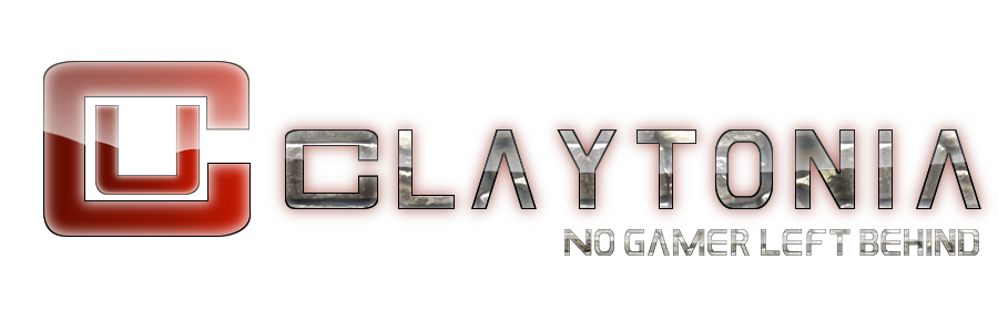
Post by: Tslat on September 28, 2013, 07:46:45 PM
Post by: Tslat on September 28, 2013, 07:46:45 PM
What about this?

I think it looks best with a black background.. but black is already my favourite colour lol
I think it looks best with a black background.. but black is already my favourite colour lol
Title: Re: logo
Post by: CommanderLeianne on September 28, 2013, 07:51:15 PM
Post by: CommanderLeianne on September 28, 2013, 07:51:15 PM
white :)
Title: Re: logo
Post by: Tslat on September 28, 2013, 08:07:36 PM
Post by: Tslat on September 28, 2013, 08:07:36 PM
Lol thanks for the feedback
Title: Re: logo
Post by: Woodsy1995 on September 28, 2013, 10:58:14 PM
Post by: Woodsy1995 on September 28, 2013, 10:58:14 PM
Amazing the transparent one
Title: Re: logo
Post by: joe21221 on September 28, 2013, 11:01:40 PM
Post by: joe21221 on September 28, 2013, 11:01:40 PM
In this small peice of artwork great pleasure i find
its well kept and joyfull and stuck in my mind
its well kept and joyfull and stuck in my mind
Title: Re: logo
Post by: Tslat on September 28, 2013, 11:03:51 PM
Post by: Tslat on September 28, 2013, 11:03:51 PM
You'd only use the transparent one, the black one is just an example to show how it goes over a background
Title: Re: logo
Post by: Zito on September 29, 2013, 06:09:25 PM
Post by: Zito on September 29, 2013, 06:09:25 PM
Looks amazing to me. It's definitely a keeper lol.
Title: Re: logo
Post by: Clay on September 30, 2013, 09:42:54 PM
Post by: Clay on September 30, 2013, 09:42:54 PM
sorry for the late reply.
I like it a lot!
I wish more people were involved in this thread so we had more input so it wasnt just tslat making the images with one or two suggestions.
I would like to see at least one more design similar to this one. Maybe with a different style for the CU or a different text, then we could have a vote. Options are always good.
Title: Re: GIVE US YOUR INPUT on the Claytonia logo/banner. READ THIS we need your help.
Post by: SwordOfSkorm on September 30, 2013, 09:46:33 PM
Post by: SwordOfSkorm on September 30, 2013, 09:46:33 PM
i prefer the balck one
Title: Re: GIVE US YOUR INPUT on the Claytonia logo/banner. READ THIS we need your help.
Post by: Clay on September 30, 2013, 09:47:15 PM
Post by: Clay on September 30, 2013, 09:47:15 PM
the background color will change, its transparent
design speaking.... do u like the CU logo and the font?
design speaking.... do u like the CU logo and the font?
Title: Re: GIVE US YOUR INPUT on the Claytonia logo/banner. READ THIS we need your help.
Post by: Clay on September 30, 2013, 09:47:51 PM
Post by: Clay on September 30, 2013, 09:47:51 PM
do u like the color of the CU?
what other fonts do u like?
do u like the green glow behind the letters?
do u like the colors of the letters?
do u like that the A in the current font?
what other fonts do u like?
do u like the green glow behind the letters?
do u like the colors of the letters?
do u like that the A in the current font?
Title: Re: GIVE US YOUR INPUT on the Claytonia logo/banner. READ THIS we need your help.
Post by: Clay on September 30, 2013, 09:48:46 PM
Post by: Clay on September 30, 2013, 09:48:46 PM
we need input on the design, not just "i like it"....what would u change?
Title: Re: GIVE US YOUR INPUT on the Claytonia logo/banner. READ THIS we need your help.
Post by: Tslat on September 30, 2013, 10:08:16 PM
Post by: Tslat on September 30, 2013, 10:08:16 PM
I can change the colors of the glow and the CU to any other colour.. I'll try making the font in a circuit board fashion instead of rocks..
Title: Re: GIVE US YOUR INPUT on the Claytonia logo/banner. READ THIS we need your help.
Post by: Clay on September 30, 2013, 10:19:55 PM
Post by: Clay on September 30, 2013, 10:19:55 PM
Quote from: Tslat on September 30, 2013, 10:08:16 PM
I can change the colors of the glow and the CU to any other colour.. I'll try making the font in a circuit board fashion instead of rocks..
i like it, just dont want to buy the first car i test drive.. ;)
Options are always better, and i was hoping for more input from the community
one option would be to use the WASD compass idea instead of the CU
im just throwing out ideas and i really do like this one
do u like the color of the CU?
what other fonts do u like?
do u like the green glow behind the letters?
do u like the colors of the letters?
do u like that the A in the current font?
Title: Re: GIVE US YOUR INPUT on the Claytonia logo/banner. READ THIS we need your help.
Post by: Tslat on September 30, 2013, 10:35:11 PM
Post by: Tslat on September 30, 2013, 10:35:11 PM
Yeah it's just unfortunate that there's not many cars in the lot lol
I'm trying my best clay
I'm trying my best clay
Title: Re: GIVE US YOUR INPUT on the Claytonia logo/banner. READ THIS we need your help.
Post by: Woodsy1995 on September 30, 2013, 10:37:11 PM
Post by: Woodsy1995 on September 30, 2013, 10:37:11 PM
The only thing i can see is i think the U needs to be a couple of millimeters up closer to the centre of the C but thats all
maybe something on the right of it aswell
a sprite from minecraft or, a mouse/joystick i just think its needs more balance and symmetry but its fantastic
maybe something on the right of it aswell
a sprite from minecraft or, a mouse/joystick i just think its needs more balance and symmetry but its fantastic
Title: Re: GIVE US YOUR INPUT on the Claytonia logo/banner. READ THIS we need your help.
Post by: Obi42 on September 30, 2013, 10:40:25 PM
Post by: Obi42 on September 30, 2013, 10:40:25 PM
Quote from: Woodsy1995 on September 30, 2013, 10:37:11 PM
The only thing i can see is i think the U needs to be a couple of millimeters up closer to the centre of the C but thats all
This.
Other than that, I like it.
Title: Re: GIVE US YOUR INPUT on the Claytonia logo/banner. READ THIS we need your help.
Post by: Clay on September 30, 2013, 10:44:06 PM
Post by: Clay on September 30, 2013, 10:44:06 PM
Quote from: Woodsy1995 on September 30, 2013, 10:37:11 PM
The only thing i can see is i think the U needs to be a couple of millimeters up closer to the centre of the C but thats all
maybe something on the right of it aswell
a sprite from minecraft or, a mouse/joystick i just think its needs more balance and symmetry but its fantastic
how about a wasd on the right side?
too much?
Title: Re: GIVE US YOUR INPUT on the Claytonia logo/banner. READ THIS we need your help.
Post by: Woodsy1995 on September 30, 2013, 10:47:43 PM
Post by: Woodsy1995 on September 30, 2013, 10:47:43 PM
Yeah i was just thinking Joystic because you could have the lead Underlining it or something but what evers good with You guys and obviously what Tslat can do
Title: Re: GIVE US YOUR INPUT on the Claytonia logo/banner. READ THIS we need your help.
Post by: Woodsy1995 on September 30, 2013, 10:49:50 PM
Post by: Woodsy1995 on September 30, 2013, 10:49:50 PM
what Program do you use btw Tslat?
Title: Re: GIVE US YOUR INPUT on the Claytonia logo/banner. READ THIS we need your help.
Post by: Tslat on September 30, 2013, 10:50:34 PM
Post by: Tslat on September 30, 2013, 10:50:34 PM
I'll move the u up a bit.. But as for something on the right.. There's a whole list of reasons why I think that's a bad idea but I can try it later I guess
Title: Re: GIVE US YOUR INPUT on the Claytonia logo/banner. READ THIS we need your help.
Post by: Tslat on September 30, 2013, 10:51:18 PM
Post by: Tslat on September 30, 2013, 10:51:18 PM
I use paint.net
Gimp
Illustrator
Photoshop
All together, since they all have different features to one another
Gimp
Illustrator
Photoshop
All together, since they all have different features to one another
Title: Re: GIVE US YOUR INPUT on the Claytonia logo/banner. READ THIS we need your help.
Post by: Woodsy1995 on September 30, 2013, 10:56:57 PM
Post by: Woodsy1995 on September 30, 2013, 10:56:57 PM
Are they all free?
Title: Re: GIVE US YOUR INPUT on the Claytonia logo/banner. READ THIS we need your help.
Post by: Tslat on September 30, 2013, 10:58:36 PM
Post by: Tslat on September 30, 2013, 10:58:36 PM
Paint.net and gimp are, illustrator and photoshop now cost like $40/month
You used to be able to buy them one-off for like $100 each but now it's monthly subscription..
You used to be able to buy them one-off for like $100 each but now it's monthly subscription..
Title: Re: GIVE US YOUR INPUT on the Claytonia logo/banner. READ THIS we need your help.
Post by: Clay on September 30, 2013, 11:39:07 PM
Post by: Clay on September 30, 2013, 11:39:07 PM
Quote from: Tslat on September 30, 2013, 10:50:34 PM
I'll move the u up a bit.. But as for something on the right.. There's a whole list of reasons why I think that's a bad idea but I can try it later I guess
I agree, i like it simple, just throwing out ideas
Title: Re: GIVE US YOUR INPUT on the Claytonia logo/banner. READ THIS we need your help.
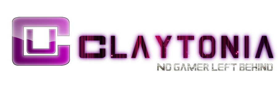
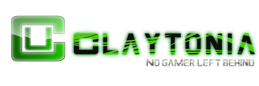
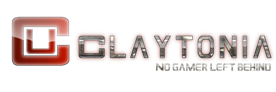
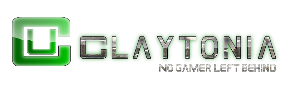
Post by: Tslat on October 01, 2013, 05:05:10 AM
Post by: Tslat on October 01, 2013, 05:05:10 AM
A few alterations:
Fixed positioning of U

Red colouring
Circuitboard background + Blue colouring

If you look closely, the blue one actually glows with circuitboard style..

Thoughts...?
Fixed positioning of U
Red colouring
Circuitboard background + Blue colouring
If you look closely, the blue one actually glows with circuitboard style..
Thoughts...?
Title: Re: GIVE US YOUR INPUT on the Claytonia logo/banner. READ THIS we need your help.
Post by: Woodsy1995 on October 01, 2013, 07:54:52 AM
Post by: Woodsy1995 on October 01, 2013, 07:54:52 AM
I love it Maybe a different colour for different games or something?
Green for Minecraft
Blue for Eve
Red for Everything else
Green for Minecraft
Blue for Eve
Red for Everything else
Title: Re: GIVE US YOUR INPUT on the Claytonia logo/banner. READ THIS we need your help.
Post by: Clay on October 01, 2013, 07:59:34 AM
Post by: Clay on October 01, 2013, 07:59:34 AM
Exactly what I was looking for, options.
I'll start a poll later today.
I'll start a poll later today.
Title: Re: GIVE US YOUR INPUT on the Claytonia logo/banner. READ THIS we need your help.
Post by: Clay on October 01, 2013, 08:01:26 AM
Post by: Clay on October 01, 2013, 08:01:26 AM
Its not too late to give constructive criticism. What do u or don't u like ?
Title: Re: GIVE US YOUR INPUT on the Claytonia logo/banner. READ THIS we need your help.
Post by: Zito on October 01, 2013, 11:19:32 AM
Post by: Zito on October 01, 2013, 11:19:32 AM
I like all three, but I think the red and green need more than what they have. The blueis too detailed compared to the others.
Title: Re: GIVE US YOUR INPUT on the Claytonia logo/banner. READ THIS we need your help.
Post by: joe21221 on October 01, 2013, 12:16:57 PM
Post by: joe21221 on October 01, 2013, 12:16:57 PM
Me gusta
Title: Re: GIVE US YOUR INPUT on the Claytonia logo/banner. READ THIS we need your help.
Post by: Woodsy1995 on October 01, 2013, 01:51:54 PM
Post by: Woodsy1995 on October 01, 2013, 01:51:54 PM
This was my Idea haha I know its crap First try sorry :)
Thanks Tslat for the programs they are amazing I also love your logos please don't think i'm trying to be your competition I could nowhere near compare to the time and effort and pure awesomeness you put into your logos.

Thanks Tslat for the programs they are amazing I also love your logos please don't think i'm trying to be your competition I could nowhere near compare to the time and effort and pure awesomeness you put into your logos.
Title: Re: GIVE US YOUR INPUT on the Claytonia logo/banner. READ THIS we need your help.
Post by: Clay on October 01, 2013, 02:10:25 PM
Post by: Clay on October 01, 2013, 02:10:25 PM
Virtual hug to woodsy. Thank u so very very much . How about woodsy circle thing in place of the cu? Just an idea , what do u think ?
Title: Re: GIVE US YOUR INPUT on the Claytonia logo/banner. READ THIS we need your help.
Post by: Zito on October 01, 2013, 02:11:30 PM
Post by: Zito on October 01, 2013, 02:11:30 PM
I like yours Woodsy. It looks like something a fancy business would have as their logo! Although, for the text, I think it should be "Claytonians Unite" then "No Gamer Left Behind". Still, awesome job on that.
Edit: I like that Idea Clay. Or, we could put a CU in the center of Woodsy's Circle? I'm thinking kind of an overlay over the center of it, and ahve it slightly faded?
Edit: I like that Idea Clay. Or, we could put a CU in the center of Woodsy's Circle? I'm thinking kind of an overlay over the center of it, and ahve it slightly faded?
Title: Re: GIVE US YOUR INPUT on the Claytonia logo/banner. READ THIS we need your help.
Post by: Woodsy1995 on October 01, 2013, 02:37:29 PM
Post by: Woodsy1995 on October 01, 2013, 02:37:29 PM
Here are the two ideas you said. Think of colours aswell


Title: Re: GIVE US YOUR INPUT on the Claytonia logo/banner. READ THIS we need your help.
Post by: Zito on October 01, 2013, 02:39:20 PM
Post by: Zito on October 01, 2013, 02:39:20 PM
I like the second one. The first one just doesn't contrast very well.
Title: Re: GIVE US YOUR INPUT on the Claytonia logo/banner. READ THIS we need your help.
Post by: Clay on October 01, 2013, 03:27:02 PM
Post by: Clay on October 01, 2013, 03:27:02 PM
agree with zito that it should be claytiona united
and i like the second on in your last post the best.
make sure they are transparent backgrounds
how about a W A S D kinda like N S E W ?
and i like the second on in your last post the best.
make sure they are transparent backgrounds
how about a W A S D kinda like N S E W ?
Title: Re: GIVE US YOUR INPUT on the Claytonia logo/banner. READ THIS we need your help.
Post by: Zito on October 01, 2013, 03:29:50 PM
Post by: Zito on October 01, 2013, 03:29:50 PM
I definitely like the idea of WASD in that pattern. I think ti will look awesome.
Title: Re: GIVE US YOUR INPUT on the Claytonia logo/banner. READ THIS we need your help.
Post by: JudgeCrane on October 02, 2013, 02:01:04 AM
Post by: JudgeCrane on October 02, 2013, 02:01:04 AM
I like the black and blue circuit board banner all the way! Id settle for that one now :)
Title: Re: GIVE US YOUR INPUT on the Claytonia logo/banner. READ THIS we need your help.
Post by: Clay on October 02, 2013, 10:04:59 AM
Post by: Clay on October 02, 2013, 10:04:59 AM
I want to give everyone who wants to a chance to give input or make an image than we will vote
Title: Re: GIVE US YOUR INPUT on the Claytonia logo/banner. READ THIS we need your help.
Post by: Farquad94 on October 02, 2013, 02:17:11 PM
Post by: Farquad94 on October 02, 2013, 02:17:11 PM
I like the blue circuit board stuff
Title: Re: GIVE US YOUR INPUT on the Claytonia logo/banner. READ THIS we need your help.
Post by: RTab on October 02, 2013, 02:43:50 PM
Post by: RTab on October 02, 2013, 02:43:50 PM
This is actually a interesting conversation..
Title: Re: GIVE US YOUR INPUT on the Claytonia logo/banner. READ THIS we need your help.
Post by: Clay on October 02, 2013, 03:33:04 PM
Post by: Clay on October 02, 2013, 03:33:04 PM
Quote from: R-Tab on October 02, 2013, 02:43:50 PM
This is actually a interesting conversation..
then give us your input!!!!!
Title: Re: GIVE US YOUR INPUT on the Claytonia logo/banner. READ THIS we need your help.
Post by: RTab on October 02, 2013, 04:34:20 PM
Post by: RTab on October 02, 2013, 04:34:20 PM
Quote from: Clay on October 02, 2013, 03:33:04 PMQuote from: R-Tab on October 02, 2013, 02:43:50 PM
This is actually a interesting conversation..
then give us your input!!!!!
I would just do Tslats but inhance all the detail in other colors
Title: Re: GIVE US YOUR INPUT on the Claytonia logo/banner. READ THIS we need your help.
Post by: Tslat on October 02, 2013, 05:14:26 PM
Post by: Tslat on October 02, 2013, 05:14:26 PM
Enhance what, sorry? I'm not sure I understand
Title: Re: GIVE US YOUR INPUT on the Claytonia logo/banner. READ THIS we need your help.
Post by: RTab on October 03, 2013, 08:43:07 PM
Post by: RTab on October 03, 2013, 08:43:07 PM
Quote from: Tslat on October 02, 2013, 05:14:26 PM
Enhance what, sorry? I'm not sure I understand
The blue seems to have higher quailty/detail then the others..
Title: Re: GIVE US YOUR INPUT on the Claytonia logo/banner. READ THIS we need your help.
Post by: Zito on October 03, 2013, 08:47:45 PM
Post by: Zito on October 03, 2013, 08:47:45 PM
Quote from: R-Tab on October 03, 2013, 08:43:07 PMQuote from: Tslat on October 02, 2013, 05:14:26 PM
Enhance what, sorry? I'm not sure I understand
The blue seems to have higher quailty/detail then the others..
I said the same thing earlier in the topic.
Title: Re: GIVE US YOUR INPUT on the Claytonia logo/banner. READ THIS we need your help.
Post by: Tslat on October 03, 2013, 09:14:10 PM
Post by: Tslat on October 03, 2013, 09:14:10 PM
That's because it's clays favourite background lol..
I'll redo the green and red huh? Any other colours you'd like to see?
I'll redo the green and red huh? Any other colours you'd like to see?
Title: Re: GIVE US YOUR INPUT on the Claytonia logo/banner. READ THIS we need your help.
Post by: Zito on October 03, 2013, 09:48:17 PM
Post by: Zito on October 03, 2013, 09:48:17 PM
Can you do a gradient?
Title: Re: GIVE US YOUR INPUT on the Claytonia logo/banner. READ THIS we need your help.
Post by: Tslat on October 03, 2013, 09:49:38 PM
Post by: Tslat on October 03, 2013, 09:49:38 PM
Possibly, what colours were you thinking?
Title: Re: GIVE US YOUR INPUT on the Claytonia logo/banner. READ THIS we need your help.
Post by: Zito on October 03, 2013, 10:04:30 PM
Post by: Zito on October 03, 2013, 10:04:30 PM
I was hoping we might be able to get a Minecraft grass gradient into dirt. After the dirt, it would go into stone and ores, and at the end, bedrock. If that's too much to ask, I was thinking a green into brown.
Title: Re: GIVE US YOUR INPUT on the Claytonia logo/banner. READ THIS we need your help.
Post by: Clay on October 03, 2013, 10:06:57 PM
Post by: Clay on October 03, 2013, 10:06:57 PM
im trying to stay away from a specific game in the logo. minecraft is the glue that holds us, but we play other games too.
Title: Re: GIVE US YOUR INPUT on the Claytonia logo/banner. READ THIS we need your help.
Post by: Zito on October 03, 2013, 10:11:20 PM
Post by: Zito on October 03, 2013, 10:11:20 PM
That's why I was thinking this part as Minecraft, then Woodsy's compass type thing as other games.
Title: Re: GIVE US YOUR INPUT on the Claytonia logo/banner. READ THIS we need your help.
Post by: Clay on October 03, 2013, 10:12:53 PM
Post by: Clay on October 03, 2013, 10:12:53 PM
cool. i cant picture things, i need to see it
Title: Re: GIVE US YOUR INPUT on the Claytonia logo/banner. READ THIS we need your help.
Post by: Zito on October 03, 2013, 10:45:59 PM
Post by: Zito on October 03, 2013, 10:45:59 PM
Yeah, I hope it isn't too much...
Title: Re: GIVE US YOUR INPUT on the Claytonia logo/banner. READ THIS we need your help.
Post by: Tslat on October 03, 2013, 11:08:45 PM
Post by: Tslat on October 03, 2013, 11:08:45 PM
Uh.... Not really.. But I don't really like it.. I'll have to talk with you guys on ts or something
Title: Re: GIVE US YOUR INPUT on the Claytonia logo/banner. READ THIS we need your help.
Post by: Zito on October 03, 2013, 11:20:57 PM
Post by: Zito on October 03, 2013, 11:20:57 PM
That will never work lol
Title: Re: GIVE US YOUR INPUT on the Claytonia logo/banner. READ THIS we need your help.
Post by: Tslat on October 03, 2013, 11:28:28 PM
Post by: Tslat on October 03, 2013, 11:28:28 PM
Why not?
Title: Re: GIVE US YOUR INPUT on the Claytonia logo/banner. READ THIS we need your help.
Post by: Zito on October 03, 2013, 11:30:37 PM
Post by: Zito on October 03, 2013, 11:30:37 PM
Time zones.
Title: Re: GIVE US YOUR INPUT on the Claytonia logo/banner. READ THIS we need your help.
Post by: Tslat on October 03, 2013, 11:45:59 PM
Post by: Tslat on October 03, 2013, 11:45:59 PM
I'll find you both sometime or other
Title: Re: GIVE US YOUR INPUT on the Claytonia logo/banner. READ THIS we need your help.
Post by: Tslat on October 04, 2013, 11:34:01 PM
Post by: Tslat on October 04, 2013, 11:34:01 PM
Ok here is another batch of styles for you guys to check out.. if you have any other suggestions feel free to post
Some of these are probably repeated, but it's just so you can see all at once


Some of these are probably repeated, but it's just so you can see all at once
Title: Re: GIVE US YOUR INPUT on the Claytonia logo/banner. READ THIS we need your help.
Post by: Obi42 on October 04, 2013, 11:43:54 PM
Post by: Obi42 on October 04, 2013, 11:43:54 PM
I like the 4th one (the first green)... but I've always been partial to green :D
Title: Re: GIVE US YOUR INPUT on the Claytonia logo/banner. READ THIS we need your help.
Post by: Clay on October 04, 2013, 11:46:20 PM
Post by: Clay on October 04, 2013, 11:46:20 PM
i will be starting a poll on which one people like the best in the next day or two. Its not too late to offer ideas or your own home made images.
Title: Re: GIVE US YOUR INPUT on the Claytonia logo/banner. READ THIS we need your help.
Post by: Zito on October 05, 2013, 11:13:51 AM
Post by: Zito on October 05, 2013, 11:13:51 AM
I love the first one! (Gold)
Title: Re: GIVE US YOUR INPUT on the Claytonia logo/banner. READ THIS we need your help.
Post by: Woodsy1995 on October 05, 2013, 11:21:17 AM
Post by: Woodsy1995 on October 05, 2013, 11:21:17 AM
Same here the gold one is amazing i still think we should have different colors for different games
Title: Re: GIVE US YOUR INPUT on the Claytonia logo/banner. READ THIS we need your help.
Post by: joe21221 on October 08, 2013, 07:07:45 PM
Post by: joe21221 on October 08, 2013, 07:07:45 PM
I also enjoy that purple one!
Title: Re: GIVE US YOUR INPUT on the Claytonia logo/banner. READ THIS we need your help.
Post by: Zito on October 08, 2013, 07:16:49 PM
Post by: Zito on October 08, 2013, 07:16:49 PM
Definitely 1 or 2 for me.